Meet the Designer Behind IHSPA’s New Logo
Meet Mina Takahashi
IHSPA saw as much excitement in 2017 as it does every year — be it through new members or the annual contests and conferences. This year, the organization also got a new look.
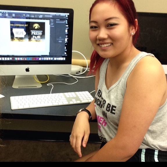
During the 2017 Advanced Graphic Design Summer Journalism Workshop, a talented student named Mina Takahashi designed a much-needed logo update for IHSPA. Takahashi said she went to the workshop to learn more about design, having been recently appointed the features editor of Iowa City High School’s Little Hawk. She said she didn’t go into the workshop thinking she would be redesigning the logo or that it would ever be used as the organization’s official logo.
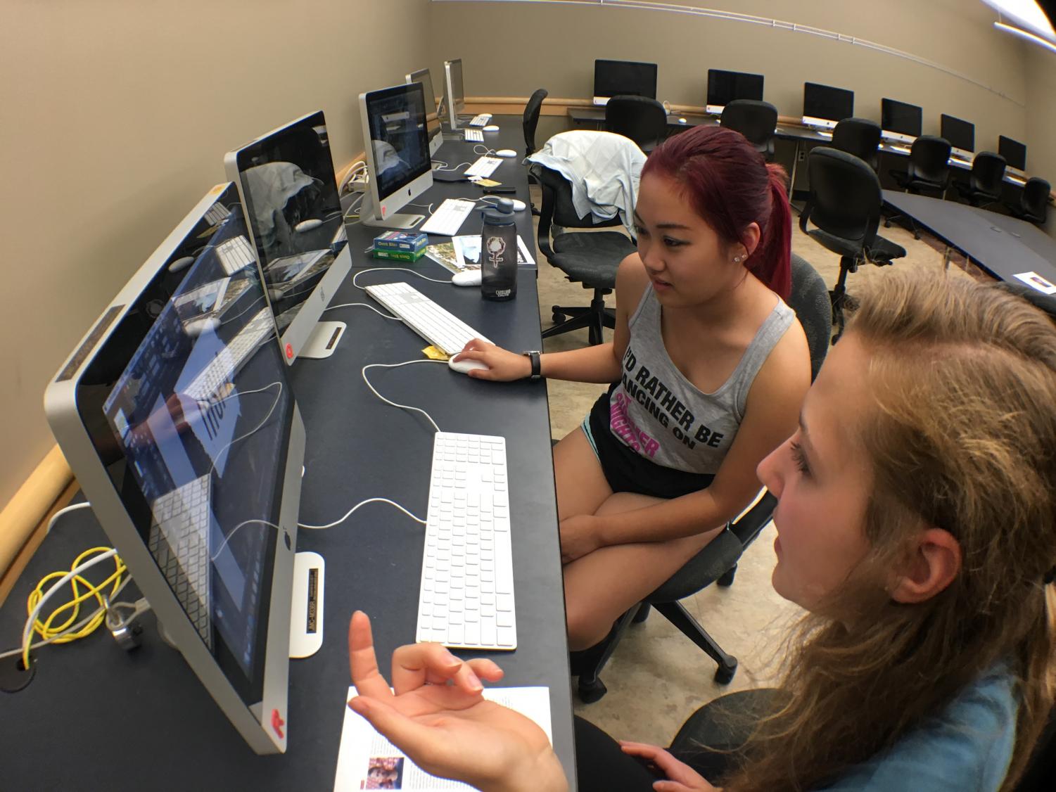
Takahashi said that, during the workshop, she worked closely with Chris Snider, who teaches at the School of Journalism and Mass Communication at Drake University. Takahashi also worked with another student from City High, Zoe Miller, on press passes that would eventually be used for the 2017 IHSPA Fall Conference. According to Takahashi, she didn’t find out right away that her designs would be used.
“[Paul Jensen] emailed me like a month later, asking for the files,” Takahashi said. “I thought he was just going to use the press pass design. I didn’t find out until I was at the conference that the logo was actually being used on the website and everything.”
The design sits at the top of the IHSPA website, and it also appeared on almost every page of the fall conference program. Recipients of any IHSPA competition awards from fall 2017 can also see the logo on their certificates.
About the Logo
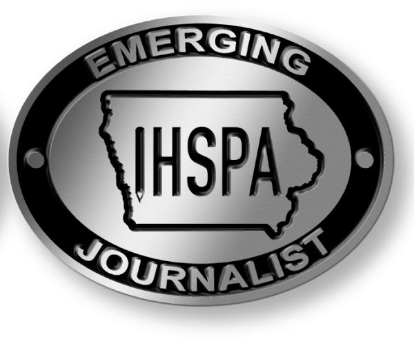
The original IHSPA logo consisted of the acronym in dual tones. It can be seen below.
Takahashi described the original logo as simplistic, saying she liked it aside from her one complaint about it.
“I didn’t know if it really fit the brand of IHSPA. You couldn’t tell it had to do with writing,” Takahashi said. “You couldn’t tell it was a journalistic brand.”
The new logo shows the IHSPA acronym in an outline of the state of Iowa. An upside-down pencil stands in place of the “I.”
Takahashi said she used the pencil to try to incorporate the writing component of IHSPA, to make the logo better reflect the mission of the organization. She also said she toyed with the idea of adding more texture to the design or including additional “pencil marks” to make the logo more different from the original. In the end, Takahashi said she decided to stick pretty close to the original look.
About the Designer
Mina Takahashi is a senior at Iowa City High School, acting as the features editor for the school newspaper the Little Hawk. Takahashi said her current plan is to double major in music as well as journalism or design. She has applied to more than ten school, and she said her top pick at the moment is Drake University. She wants to go into magazine design after getting her degree.
Takahashi also attended the IHSPA 2017 fall conference.
“It was really helpful,” Takahashi said. “All the individual workshops were cool and helped me learn even more to take back [to the Little Hawk].”
According to Takahashi, she is also working on a portfolio to submit for the Iowa Designer of the Year Award.